Conversion Rate Optimization
How to Increase Landing Page Conversion Rate - 15 Tips

How to Increase Landing Page Conversion Rate: 15 Tips
Getting visitors to your landing page is only half the job.
You can have a well-optimized Google Ads campaign, strong ad copy, and a steady stream of traffic, but if visitors leave without taking action, you're paying for clicks without getting enough business from them.
This is why landing page conversion rate optimization matters.
A landing page should make it easy for visitors to understand what you're offering, why it matters to them, and what they should do next. Whether your goal is generating leads, getting demo requests, selling products, collecting registrations, or driving phone calls, small improvements to your landing page can have a meaningful impact on campaign performance.
Google also recommends making landing pages relevant to the ad and keywords that brought users there, keeping them mobile-friendly, making navigation simple, and providing useful content.
In this guide, we'll look at 15 practical ways to increase landing page conversion rate without turning your page into a complicated sales funnel.
What Is Landing Page Conversion Rate?
Your landing page conversion rate is the percentage of visitors who complete the action you want them to take.
The basic formula is:
Conversion Rate = (Conversions ÷ Landing Page Visitors) × 100
For example, if 1,000 people visit your landing page and 50 submit your enquiry form, your conversion rate is 5%.
But conversion doesn't always mean a form submission.
Depending on your business, a conversion could be:
- A lead form submission
- A phone call
- A WhatsApp enquiry
- A product purchase
- A demo booking
- A consultation request
- An account registration
- A newsletter signup
Before trying to increase your conversion rate, define exactly what a successful conversion means for that page.
1. Match Your Landing Page to the Ad
One of the biggest landing page conversion mistakes is sending every visitor to the same generic page.
Imagine someone searches for "Google Ads management agency" and clicks an ad specifically about Google Ads management. If the visitor lands on a generic homepage where they have to search for the relevant service, you've introduced unnecessary friction.
Instead, the landing page should continue the conversation started by the ad.
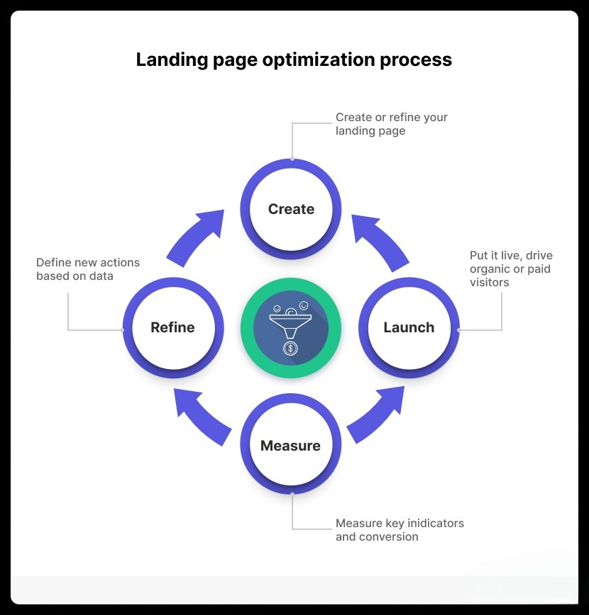
For example:
Search: Google Ads agency Ad: Google Ads Management for Lead Generation Landing Page: Google Ads Management Service
This creates a clear connection between the user's search, your advertisement, and your offer.
Google specifically recommends keeping the landing page relevant to the ad and keyword themes because visitors expect the page to deliver what the ad promised.
If you're running paid campaigns, this is also closely connected to your overall Google Ads landing page experience.
For businesses running Google Ads, our Google Ads management service focuses on connecting campaign targeting, ad messaging, tracking, and landing page performance.
2. Write a Clear, Benefit-Focused Headline
Your headline is usually one of the first things visitors notice.
It shouldn't force people to figure out what you actually offer.
Weak:
"Digital Marketing Solutions for Modern Businesses"
Better:
"Generate More Qualified Leads With Google Ads"
The second headline immediately tells the visitor what the service does and what outcome they can expect.
A good landing page headline should answer one basic question:
"Am I in the right place?"
You can then use a supporting subheadline to explain how you deliver the benefit.
Don't try to make the headline clever at the expense of clarity. In conversion optimization, clarity usually beats creativity.
3. Make Your CTA Impossible to Miss
A call to action (CTA) tells visitors what to do next.
Examples include:
- Get a Free Consultation
- Request a Quote
- Book a Strategy Call
- Get Your Free Audit
- Start Your Project
- Shop Now
- Request a Demo
Avoid vague CTAs such as "Submit" when you can explain what happens next.
For example:
Submit
is less informative than:
Get My Free Google Ads Audit
Your CTA should also be visible without requiring visitors to scroll through half the page.
For longer landing pages, repeat the primary CTA at logical points rather than making visitors scroll back to the top.
4. Reduce the Number of Form Fields
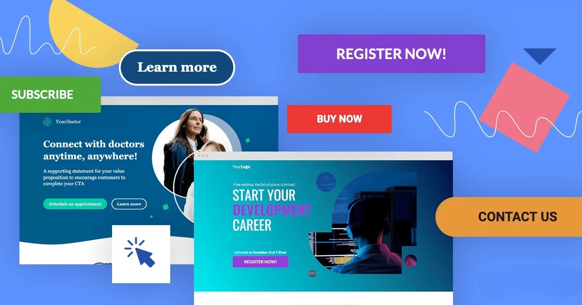
Every additional field can create another reason for someone to abandon your form.
If you only need a name, email address, and phone number to start a conversation, don't necessarily ask for ten additional pieces of information.
For example, a simple lead form could ask for:
- Name
- Work email
- Phone
- Company
- What do you need help with?
You can collect additional information during the sales process.
That doesn't mean shorter forms are always better. If you're selling a high-value service and need qualification information, additional fields can help improve lead quality.
The goal isn't simply to generate more form submissions.
It's to generate more useful conversions.
5. Show the Value of Your Offer Immediately
Visitors shouldn't have to scroll through several sections before discovering why they should care.
Your landing page should communicate the core value near the top of the page.
Think about:
- What problem are you solving?
- Who is the offer for?
- What outcome can the customer expect?
- What makes your solution different?
- What should the visitor do next?
For example, instead of simply saying:
"We provide SEO services."
you could explain:
"Build sustainable organic traffic with SEO focused on rankings, qualified visitors, and business growth."
The second version gives the visitor more context.
6. Add Social Proof
People naturally look for evidence before making a decision.
Social proof can reduce uncertainty and make your offer more credible.
Depending on your business, consider adding:
- Customer testimonials
- Case studies
- Client logos
- Reviews
- Results
- Industry certifications
- Relevant awards
- Trust badges
For a marketing agency, case studies can be particularly useful because they demonstrate what happened after a client worked with you.
For example, you can connect your landing page visitors to relevant case studies rather than simply claiming that your service produces results.
The important part is authenticity. Don't add generic testimonials simply to fill space.
7. Use Numbers Where They Actually Matter
Specific numbers can make an offer easier to understand.
Instead of:
"We generate excellent results."
consider:
"145+ leads generated at a $21 average CPL."
Numbers can provide context that vague marketing language doesn't.
This can include:
- Leads generated
- Cost per lead
- ROAS
- Revenue
- Conversion rate
- Time saved
- Number of customers
- Percentage improvement
However, only use numbers that are accurate and can be supported.
8. Make the Page Mobile-Friendly
A landing page that looks great on a desktop can still perform poorly on mobile.
Check:
- Is the headline readable?
- Can users tap buttons easily?
- Does the form fit the screen?
- Are images compressed?
- Does the page load quickly?
- Is important information visible without excessive scrolling?
- Are phone and WhatsApp buttons easy to use?
Google notes that mobile usability and speed are important parts of creating an effective landing page experience.
Don't only test the page by resizing your desktop browser.
Actually open it on different mobile devices.
9. Improve Landing Page Speed
A slow page can lose visitors before they even see your offer.
This is particularly important when your traffic comes from paid advertising. You're paying to bring users to the page, so you don't want unnecessary technical problems causing them to leave.
Look at:
- Image file sizes
- JavaScript
- Third-party scripts
- Fonts
- Videos
- Unnecessary animations
- Hosting performance
- Browser caching
Google's landing page guidance also highlights page speed as an important consideration, particularly for mobile traffic.
Before adding another animation or large video to your landing page, ask whether it actually helps the visitor make a decision.
10. Remove Unnecessary Distractions
A landing page has one primary objective.
That doesn't mean every page must contain nothing except a form, but unnecessary distractions can make the conversion path less obvious.
Look for:
- Too many navigation links
- Multiple competing CTAs
- Unrelated offers
- Excessive pop-ups
- Distracting animations
- Huge blocks of text
- Unnecessary menu items
For paid traffic, a dedicated landing page can sometimes work better than sending visitors to a busy homepage because it gives the visitor a more focused path.
Google also recommends making landing pages easy to navigate and helping users quickly perform the intended action.
11. Address Objections Before Asking for the Conversion
A visitor may be interested but still hesitate.
They might be thinking:
- Is this suitable for my business?
- How much does it cost?
- How long does it take?
- Will this work in my industry?
- What happens after I submit the form?
- Is there a contract?
- Can I speak to someone first?
Your landing page should answer the most important objections before the CTA.
An FAQ section is useful here.
For example:
"How long does it take to launch?"
"What information do you need from me?"
"Do you manage the campaigns after setup?"
"Which countries do you work with?"
Answering these questions can reduce uncertainty and make the final conversion easier.
12. Use Strong Visual Hierarchy
Visitors don't read every word on a landing page.
They scan it.
Your design should make the important information easy to find.
Use:
- Clear headings
- Short paragraphs
- Bullet points
- Whitespace
- Contrasting CTA buttons
- Relevant images
- Simple sections
Your most important message should visually stand out from supporting information.
Don't make every element equally prominent. If everything is highlighted, nothing is highlighted.
13. Test Different Offers and CTAs
You don't have to redesign the entire page every time you want to improve conversion rate.
Start with individual elements.
Test:
Headline A: "Get More Leads With Google Ads"
Headline B: "Turn Google Search Traffic Into Qualified Leads"
Or test:
CTA A: "Book a Call"
CTA B: "Get Your Free Strategy Call"
You can also test:
- Form length
- CTA placement
- Testimonials
- Pricing presentation
- Hero section
- Images
- Page layout
- Offer wording
Don't judge a test based on a handful of conversions. Give experiments enough data to produce a meaningful comparison.
14. Track Every Important Conversion
You can't properly optimize a landing page if you don't know what visitors are doing.
At minimum, consider tracking:
- Form submissions
- Phone clicks
- Email clicks
- WhatsApp clicks
- Booking clicks
- Purchases
- Key button clicks
Tools such as Google Tag Manager and Google Analytics can help you understand which actions users take on the page.
If you're interested in setting this up correctly, our guide on Google Tag Manager setup and tracking covers the fundamentals of creating a more reliable tracking setup.
For businesses that need help connecting website actions with advertising platforms, you can also explore our conversion tracking service.
15. Optimize Based on Data, Not Assumptions
This is probably the most important landing page optimization tip.
Don't assume your page is performing poorly because you personally don't like the design.
Look at the data.
For example:
High traffic + low conversions
This could indicate a problem with the offer, page relevance, CTA, form, trust, or user experience.
Low traffic + high conversion rate
The landing page may be working reasonably well, but your acquisition strategy may need attention.
High mobile traffic + lower mobile conversion rate
Investigate the mobile experience, page speed, form usability, CTA placement, and readability.
High form starts + low form completions
Your form may be creating unnecessary friction.
The landing page should be treated as an ongoing part of your marketing system rather than a page you build once and never touch again.
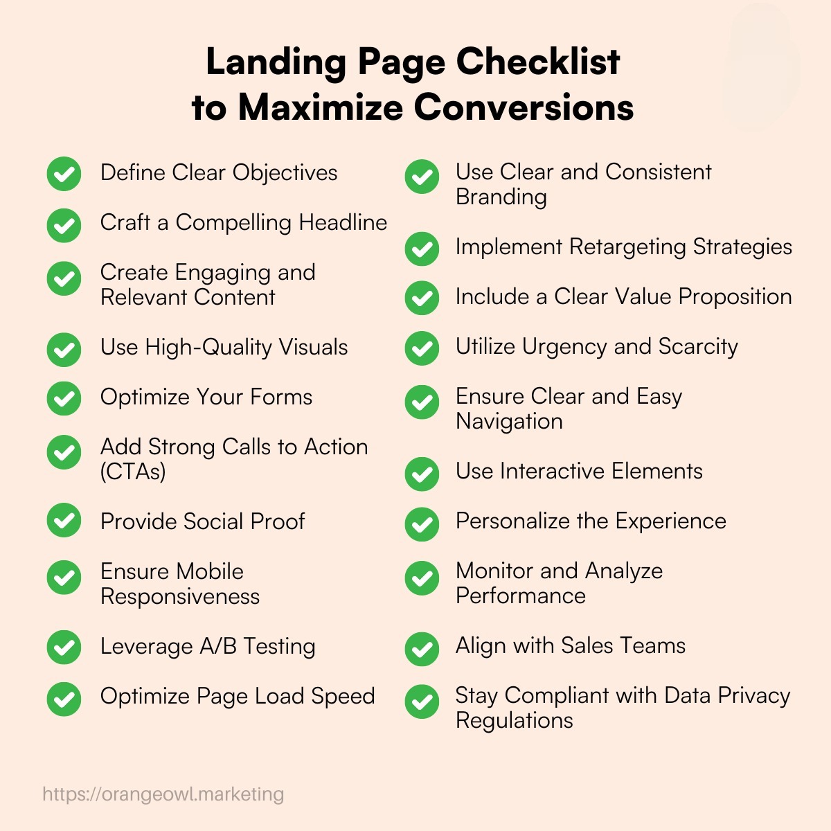
Landing Page Conversion Rate Optimization Checklist
Before launching a campaign, run through this quick checklist:
- Is the headline clear?
- Does the page match the ad?
- Does the page match the user's search intent?
- Is the primary CTA obvious?
- Is the offer explained clearly?
- Is the form easy to complete?
- Is the page mobile-friendly?
- Does the page load quickly?
- Are testimonials or proof available?
- Are important objections answered?
- Are unnecessary distractions removed?
- Are conversions being tracked?
- Have you tested different headlines and CTAs?
- Are you reviewing conversion data regularly?
Google's guidance similarly emphasizes relevance between the user's search, ad, and landing page, along with mobile usability, clear actions, useful content, and ease of navigation.
Final Thoughts
Improving your landing page conversion rate doesn't always require a complete redesign.
Sometimes the biggest improvement comes from making one thing clearer.
It could be a better headline, a more relevant offer, a shorter form, stronger proof, a faster mobile experience, or a CTA that tells visitors exactly what happens next.
The key is to connect the entire customer journey.
Your keyword should reflect the user's intent. Your ad should address that intent. Your landing page should deliver on the promise made by the ad. Your CTA should make the next step obvious. And your tracking should tell you what happened after the click.
If you're investing in Google Ads, Meta Ads, or SEO services, landing page optimization should be considered part of the wider acquisition strategy rather than an isolated design task.
At Scale With Clicks, we help businesses connect paid advertising, conversion tracking, landing pages, and performance marketing into a more measurable growth system.
The goal isn't simply to get more traffic.
It's to get more value from the traffic you're already paying for.