Landing Page Optimization
Landing Page Design - 15 Best Practices for Higher Conversions

Category: Landing Page Optimization
Landing Page Design: 15 Best Practices for Higher Conversions
Getting visitors to your website is only half the battle.
You can run a well-optimized Google Ads campaign, publish helpful SEO content, or spend money promoting your business on Meta, but none of that matters much if visitors arrive on your landing page and leave without taking action.
A good landing page design is built around one simple objective: helping the right visitor understand the offer, trust the business, and take the next step.
That next step could be submitting a form, booking a consultation, requesting a quote, making a purchase, or calling your business.
Google also recommends making landing pages relevant to the ad and keywords, mobile-friendly, easy to navigate, useful, and clear about the desired action.
In this guide, we'll look at 15 landing page design best practices that can help improve your conversion rate and get more value from the traffic you're already generating.
What Is a Landing Page?
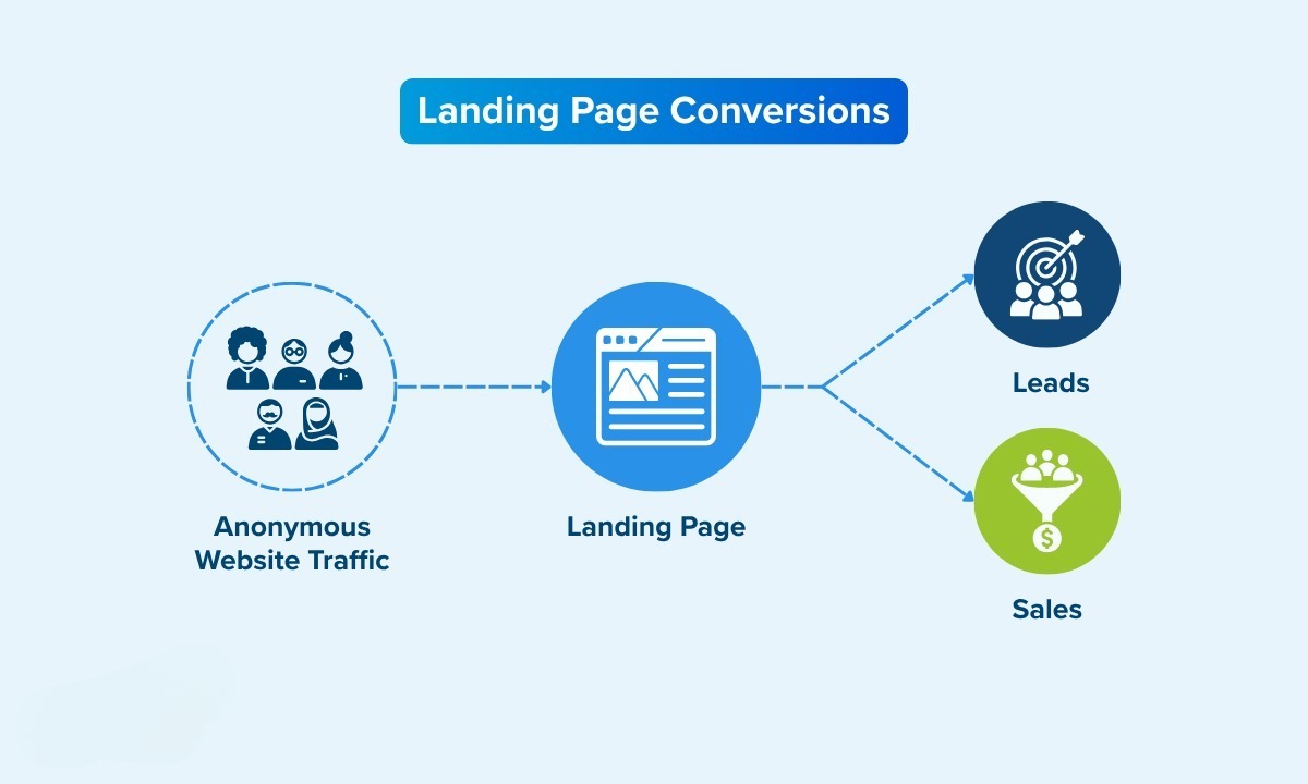
A landing page is a dedicated webpage designed around a specific marketing goal.
Unlike a typical website page, a landing page usually focuses on one offer, audience, service, product, or conversion objective.
For example, if someone searches for "Google Ads management services" and clicks your advertisement, sending them to a dedicated Google Ads landing page is usually more relevant than sending them to a general homepage.
The visitor immediately sees information related to what they searched for.
This creates a much clearer journey:
Search → Ad → Landing Page → Action
Your landing page should continue the conversation that started with your advertisement or marketing message.
If you're interested in how landing pages fit into the wider paid advertising funnel, our guide on how to generate leads with Google Ads covers the process in more detail.
15 Landing Page Design Best Practices for Higher Conversions
1. Give Your Landing Page One Clear Goal
One of the most important landing page optimization principles is keeping the page focused.
Don't ask visitors to:
- Download an ebook
- Book a call
- Subscribe to a newsletter
- Read five different blog posts
- Follow you on social media
- Request a quote
all at the same time.
Too many options can make the visitor hesitate.
Instead, decide what the primary conversion should be.
For a lead generation page, that might be:
"Book a Free Strategy Call"
For an eCommerce page:
"Buy Now"
For a SaaS business:
"Start Free Trial"
Everything on the page should support that objective.
2. Create a Strong, Benefit-Focused Headline
Your headline is often the first thing visitors read.
It should quickly answer one question:
"What do I get from this?"
Weak:
Digital Marketing Services
Stronger:
Generate More Qualified Leads With Performance Marketing
The second version communicates an outcome rather than simply describing a service.
Your headline should also be consistent with the advertisement or search query that brought the visitor to the page.
Google specifically recommends maintaining a strong connection between the ad, keywords, and landing page.
3. Match the Landing Page to the Ad
This is commonly called message match.
Imagine someone searches:
Google Ads agency for lead generation
They click an ad saying:
Generate More Leads With Google Ads
But the landing page headline says:
Welcome to Our Digital Marketing Company
There is a disconnect.
The visitor has to figure out whether they are actually in the right place.
Instead, the landing page should reinforce the same message:
Google Ads Management Focused on Qualified Lead Generation
The closer the relationship between the search query, advertisement, and landing page, the easier it is for the visitor to understand the offer.
This is also important for Google Ads landing page experience and overall campaign relevance.
4. Put Your Main CTA Above the Fold
Visitors shouldn't have to scroll through half the page before discovering what to do next.
Your primary call to action (CTA) should normally be visible near the top of the page.
For example:
Get Your Free Google Ads Audit
or
Book a Strategy Call
The CTA should stand out from surrounding content without looking like an aggressive advertisement.
Also repeat the CTA naturally throughout longer landing pages.
You could have one near the hero section, another after the benefits section, and another near the bottom.
5. Keep Your Landing Page Design Simple
Good landing page design isn't about adding more elements.
It's about removing unnecessary ones.
Avoid:
- Excessive animations
- Too many pop-ups
- Huge blocks of text
- Unnecessary navigation
- Distracting graphics
- Multiple competing CTAs
- Complicated forms
A clean layout makes it easier for visitors to understand the offer.
Think of every section and ask:
"Does this help the visitor make a decision?"
If the answer is no, consider removing it.
6. Explain the Benefits, Not Just the Features
Businesses often describe what they provide without explaining why the customer should care.
For example:
Google Ads Campaign Management Keyword Research Conversion Tracking Campaign Optimization
These are features.
Instead, connect them to benefits:
Generate More Qualified Leads Reduce Wasted Ad Spend Understand Which Campaigns Drive Revenue Make Better Decisions With Accurate Conversion Data
People aren't buying "keyword research."
They're buying the potential outcome that good keyword research can help create.
7. Add Social Proof and Trust Signals
Visitors may be interested in your offer but still have doubts.
That's where trust signals become important.
Depending on your business, consider adding:
- Customer testimonials
- Case studies
- Client logos
- Reviews
- Results
- Certifications
- Industry experience
- Security badges
- Guarantees where appropriate
For example, instead of saying:
We generate leads for businesses.
you could show a real result:
145+ Leads Generated for a Healthcare Campaign
Specific evidence is generally more convincing than generic claims.
You can also link visitors to relevant case studies if they want to see more detailed results.
8. Use High-Quality, Relevant Images
Images should support your message rather than simply fill empty space.
For a service business, useful visuals could include:
- Campaign dashboards
- Product screenshots
- Before-and-after examples
- Customer results
- Team photographs
- Process diagrams
- Service illustrations
Avoid using generic stock photos that have nothing to do with your offer.
For example, a picture of a random person smiling at a laptop doesn't necessarily explain why someone should hire your agency.
A screenshot showing campaign performance or a simple visual explaining your process may be much more useful.
9. Make the Form Easy to Complete
Long forms can discourage people from converting.
If you only need a name, email address, phone number, and company name, don't ask for 15 additional pieces of information.
Start with the information your sales process actually needs.
For example:
Name Work Email Phone Company What do you need help with?
That's often enough to start a conversation.
For higher-value services, you may need additional qualification questions, but every extra field should have a purpose.
The goal isn't necessarily to collect the maximum amount of information.
It's to collect enough information to move the prospect to the next stage.
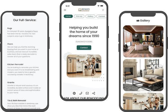
10. Design for Mobile First
A landing page that looks excellent on desktop can still perform badly on smartphones.
Check:
- Font size
- Button size
- Form usability
- Image scaling
- Page spacing
- Navigation
- Page speed
- CTA visibility
Your CTA should be easy to tap with a thumb.
Forms should not require excessive zooming.
Text should remain readable without horizontal scrolling.
Google specifically recommends mobile-friendly landing pages and highlights speed and ease of contact as important parts of a good mobile experience.
11. Improve Your Landing Page Loading Speed
A beautiful landing page doesn't help if visitors leave before it finishes loading.
Large images, unnecessary scripts, excessive animations, third-party widgets, and poorly optimized code can all slow down a page.
This becomes particularly important when you're paying for traffic.
You are effectively paying to bring someone to your website. You don't want a slow page to lose that visitor before they even see your offer.
Google's own guidance recommends monitoring landing page performance and specifically highlights the importance of mobile speed.
Compress images, remove unnecessary scripts, use modern image formats where appropriate, and regularly test your pages.
12. Use Clear and Specific CTA Copy
"Submit" isn't very persuasive.
Your CTA should tell people what happens when they click.
Instead of:
Submit
try:
Get My Free Audit
Instead of:
Contact Us
try:
Book a Strategy Call
Instead of:
Learn More
try:
See How We Can Help
Specific CTAs reduce uncertainty.
The visitor knows what action they're taking and what they can expect next.
13. Address Objections Before They Become a Problem
A visitor may have several questions before converting:
- How much does it cost?
- Is there a contract?
- How long does it take?
- Do you work with businesses like mine?
- What happens after I submit the form?
- Can I cancel?
- Have you achieved results before?
Your landing page should answer the most important objections.
An FAQ section works well for this.
You can also include information about your process, expected timelines, pricing ranges, or what happens after someone contacts you.
This can reduce friction and help qualified visitors feel more comfortable taking action.
14. Connect Your Landing Page With Conversion Tracking
You can't properly optimize a landing page if you don't know what visitors are doing.
Track meaningful actions such as:
- Form submissions
- Phone clicks
- WhatsApp clicks
- Email clicks
- Booking clicks
- Purchases
- Lead form completions
This is where conversion tracking becomes extremely important.
For example, if a landing page receives 1,000 visitors and generates 40 leads, you know the conversion rate is 4%.
But you can go further.
You can compare:
- Desktop vs mobile
- Different traffic sources
- Different campaigns
- Different landing page versions
- Different CTAs
- Different forms
Accurate tracking gives you the information required to make better optimization decisions.
If your tracking setup needs improvement, take a look at our conversion tracking services.
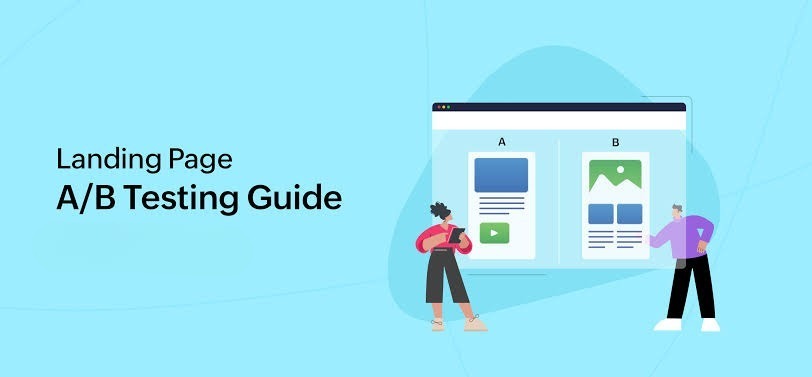
15. Test, Measure and Improve
There is no universal landing page design that converts perfectly for every business.
What works for an eCommerce brand may not work for a B2B company.
That's why testing matters.
You can test:
- Headlines
- CTA copy
- Form length
- Page layout
- Images
- Testimonials
- Offers
- Pricing presentation
- Trust signals
- Button placement
Don't change everything at once.
If you change the headline, form, CTA, images, and layout simultaneously, it becomes difficult to understand what actually caused the improvement.
Start with the biggest potential problem.
Then measure the results.
For more practical conversion ideas, you can also read our guide on how to increase landing page conversion rates.
Landing Page Design and SEO
Landing pages aren't only useful for paid advertising.
They can also support your broader SEO strategy.
A well-structured landing page should have:
- A clear primary keyword
- Search-intent-focused content
- Useful headings
- Descriptive page titles
- A compelling meta description
- Internal links
- Relevant supporting content
- Good mobile usability
- Fast loading speed
However, don't turn the page into a collection of keywords.
Write for the visitor first.
If you're working on your wider organic visibility, our SEO Services can help businesses build a more comprehensive search strategy.
You can also read our Google Ads Quality Score guide to understand how relevance, ad quality, and landing page experience fit together.
Landing Page vs Homepage: What's the Difference?
A homepage usually introduces the entire business.
A landing page is much more focused.
For example, your homepage might include links to:
- Google Ads
- Meta Ads
- SEO
- Conversion Tracking
- About Us
- Case Studies
- Contact
A dedicated Google Ads landing page, on the other hand, can focus entirely on convincing someone interested in Google Ads to take action.
This is especially useful for paid advertising campaigns.
If you're running a Google Ads campaign for a specific service, consider sending traffic to the most relevant Google Ads service page rather than automatically sending everyone to the homepage.
Landing Page Conversion Rate: What Should You Aim For?
There isn't one conversion rate that every landing page should achieve.
A reasonable target depends on:
- Industry
- Traffic source
- Search intent
- Offer
- Audience
- Price
- Competition
- Device
- Form complexity
Instead of obsessing over an industry benchmark, establish your current conversion rate first.
Then work on improving it.
For example:
Current: 2.5% After optimization: 3.2% Later: 4.1%
Even a relatively small improvement can have a meaningful impact when the page receives thousands of visitors.
Landing Page Design Checklist
Before launching a landing page, run through this quick checklist:
- Does the page have one primary goal?
- Is the headline immediately clear?
- Does the page match the ad and search intent?
- Is the main CTA visible near the top?
- Are the benefits easy to understand?
- Is there enough social proof?
- Are objections addressed?
- Is the form simple?
- Does the page work well on mobile?
- Does it load quickly?
- Are images relevant and optimized?
- Is conversion tracking working?
- Are important CTAs repeated naturally?
- Is unnecessary navigation removed?
- Do you have a plan for testing improvements?
If several of these answers are "no," there is probably room for improvement.
Final Thoughts
A high-converting landing page isn't necessarily the page with the most impressive animations, the longest copy, or the most complicated design.
It is the page that makes the decision easy.
The visitor should quickly understand:
What is this? Is it relevant to me? Can I trust this business? What do I get? What should I do next?
Get those five things right and you have a much stronger foundation for conversion rate optimization.
And remember, landing page optimization shouldn't happen in isolation.
Your ad targeting, ad copy, landing page, conversion tracking, follow-up process, and overall offer all work together.
If you're investing in paid traffic, improving the page that receives that traffic can be one of the most practical ways to get more value from your existing advertising budget.
If you want to improve your overall performance marketing strategy, explore Scale With Clicks or learn more about our Google Ads services, Meta Ads services, and SEO services.
Frequently Asked Questions
What makes a landing page high converting?
A high-converting landing page clearly communicates the offer, matches the visitor's intent, builds trust, loads quickly, works well on mobile devices, and provides a simple next step.
Should a landing page have a navigation menu?
Not always. If the objective is a specific conversion, reducing unnecessary navigation can help keep visitors focused. However, the right approach depends on the business, audience, and purpose of the page.
How many CTAs should a landing page have?
A landing page can have multiple instances of the same primary CTA. For example, you might place the same "Book a Strategy Call" CTA near the top, middle, and bottom of the page. The important thing is to avoid competing primary actions.
Should I send Google Ads traffic to my homepage?
Usually, a dedicated page that closely matches the search intent and ad message is preferable to a generic homepage. Google recommends making the landing page relevant to the ad and keywords.
How can I improve my landing page conversion rate?
Start by reviewing your headline, offer, CTA, page speed, mobile experience, form, trust signals, and message match. Then use conversion tracking and testing to identify which changes actually improve results.
How important is mobile landing page design?
Very important. A significant portion of paid and organic traffic can come from mobile devices, so your page should be easy to read, navigate, and convert on a smaller screen.